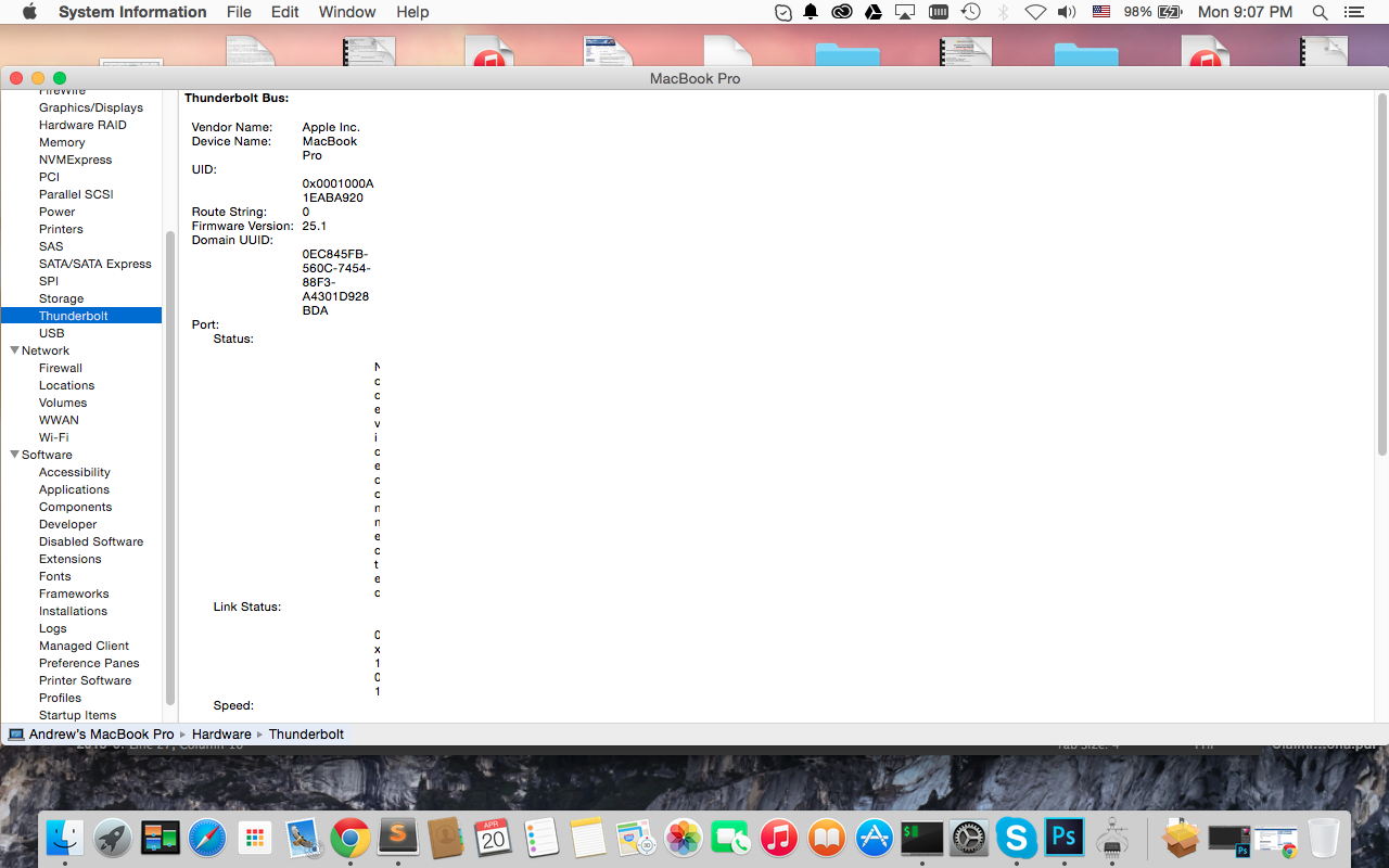
It seemed like Apple is attention to details nowadays compared to before. Here is how system info look like after the last Mac OS X 10.10.3 update. The columns on the rightmost side is too narrow and I have to make the window very wide for it to be readable. I tested in another computer and it is the same.